Evernote Version 6 Gets All Dolled Up With UI Enhancements And Plenty Of Floating Buttons
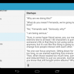
The developers have touched up the UI, redesigned the search screen, and brought in a new sidebar. Now when users swipe their finger from the left, a navigation drawer slides in with access to their notebooks, tags, and shortcuts. Throughout it all, the floating button is there.
On the functionality side of things, there’s web clipping support, so users can take a portion of a web page and get it out to others using the Android share menu. Speaking of sharing, notebooks are now easier to get out to people as well. When one is open, users can just tap a button at the bottom and invite the people they want to share the notebook with.
The changes don’t stop there. Here are some additional bullet points, but hit up the source link below to get everything straight from the horse’s mouth.
- Cleaner note editor layout improves viewing and updating notes
- Redesigned tablet experience
- New camera makes switching between modes a snap
- Enhanced handwriting support with pinch to zoom and better recognition
Source: Evernote blog
Source : Android Police – Android News, Apps, Games, Phones, Tablets » Apps/Games
![[Update: Wide Rollout?] Google Now Bill Reminders Rolling Out Now](http://apkvan.com/wp-content/uploads/2014/09/1u89jyQ-150x150.jpg)

![[Updated] Google Chrome Beta Updated To v39 With Reader Mode And Tweaked Tab Closing Animation [APK Download]](http://apkvan.com/wp-content/uploads/2014/10/1sPl23T-150x150.png)


Leave a Reply