Flickr Update Brings Two-Column Layout For Tablets Plus Improved Sharing, Cropping, And Lightbox View For Everyone
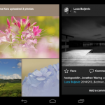
Flickr has updated its Android offering with a series of improvements, most notably a more appropriate two-column view in the activity feed for tablet users. Beyond the widescreen-specific feature addition, there are also enhancements to your ability to share photos within the app, crop your uploaded photos, and browse photos with a fullscreen lightbox view.
Giving tablets a more efficient layout is a pretty major addition, if only because enjoying photography is one of the big advantages of the larger screen. Every app that optimizes for large screens increases the overall value proposition for Android tablets. The software ecosystem for Android compared to its competition in that form factor has even led one of our own writers to prefer a competing operating system in that product category. Developments like this will help keep Android competitive in that evolving marketplace.
Among the updates for devices of all sizes is the ability to browse photos within the full-screen lightbox view. Previously, you would need to exit this view in order to look at something else. Now, you can just swipe to get from one picture to the next.
Flickr has also added more options to the in-app photo cropping feature and added the ability to share multiple photos in one batch rather than individually. The update should be pushed to your device by now if you already have Flickr installed. If you don’t have it installed and you’re into photography, you should obviously check it out.
Source : Android Police – Android News, Apps, Games, Phones, Tablets » Apps/Games


Leave a Reply