Google Play Newsstand Gets A Material Makeover, Improved Magazine Interface On Phones, And More
It’s hard to believe that it’s been nearly a year since Google rebranded Play Magazines to Newsstand, essentially combining Magazines and Currents into one app. While we’ve seen updates come and go to Newsstand over the months, today’s update marks the biggest one yet: a complete makeover.
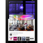
According to the Android Blog, Newsstand is now using Material Design, which incorporates “larger images, more contextual headers, and smoother transitions” into the overall feel of the app. Users are also able to swipe horizontally between topics, as well as vertically to get more info on a particular topic. So, really, it’s more intuitive.
Also new with this update is a better way to read magazines on phones. The experience has generally been fine on tablets (to me, anyway), but definitely needed some work on the smaller screen. As of now, phones will get the option to pick and choose between articles, which will display in a much easier to read format – more like that of the current News section of the app. Improved topic cards are now front and center, making it even easier to find content relevant to your interests.
The updated Newsstand app should be hitting the Play Store any time now.
Source : Android Police – Android News, Apps, Games, Phones, Tablets » Apps/Games


Leave a Reply