gReader Gets Material Design And Lollipop Support In 4.0 Update, Is Actually Material And Still Has Customizable Themes
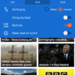
In a major update, gReader has given itself a brand new look in addition to support for Lollipop devices. Unlike many recent app updates that have claimed to add Material Design, gReader is not exaggerating in their claim; it looks very good. And, true to form, gReader has preserved the ability to customize its look with themes, so you can still make it your own.
gReader’s 3.x versions already had a fairly modern look, so it wasn’t a great leap to conform to Material Design guidelines. Nonetheless, when comparing the new and old look, the redesign looks far better.
And while this cannot be adequately conveyed through pictures, the 4.0 update really nails the animations that make Material Design more than just a color palette. On Lollipop devices, the animation touches are even more apparent. The floating button is there for everyone, though it isn’t all that useful except as a shortcut to mark all as read. Beyond the Material-oriented changes to the look, a “card view” has been added to the existing list and grid options.
While the end of Google Reader is still a sore spot for many, gReader has taken the mantle admirably. As far as an Android interface goes, we could not have hoped for better from Google if they had maintained it. If you are new to gReader, you will need an account from Feedly or The Old Reader to bring your feed subscriptions over. Alternatively, you can add RSS feeds manually. The app is free, with in-app purchases to remove ads, add widgets, and give you additional customization.
Source: noinnion blog
Source : Android Police – Android News, Apps, Games, Phones, Tablets » Apps/Games

![Google Messenger Update Brings Custom Conversation Colors And No More Laggy Thread Opening Animation [APK Download]](http://apkvan.com/wp-content/uploads/2014/12/11WlKBM-150x150.png)
![[Updated] Google Chrome Beta Updated To v39 With Reader Mode And Tweaked Tab Closing Animation [APK Download]](http://apkvan.com/wp-content/uploads/2014/10/1sPl23T-150x150.png)
Leave a Reply