Mint App Gets Yet Another Redesign With Some Material Touches And A New Icon


Here’s the changelog for v3.8.
- Improved App Startup Time
- Improved Data Refresh Speed
- Fresh New Look and Feel
- Added Floating Android Action Button To Create Manual Transactions
- Squished Bugs
After you get used to finding the new icon in your app drawer, you’ll probably notice the floating action button. It’s there so you can add manual transactions, but it feels a little out of place as it covers up the UI. The shade of green throughout the app is different, and tablets have a bit more green in the design. If you wanna see just how green (super-green), you’ll have to download the app.
Source : Android Police – Android News, Apps, Games, Phones, Tablets » Apps/Games
Related Posts
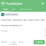 Pushbullet Browser Extensions Get Updated Look That Matches The Android App And Website
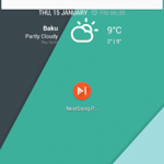 NextSong Puts Track Info And Music Controls In A Handy Heads Up Notification
![[New App] Google Wants You To Build A MacGyver Version Of The Oculus Rift Out Of Cardboard And Stick Your Phone In It](http://apkvan.com/wp-content/uploads/2014/06/1iGSiap-150x150.jpg) [New App] Google Wants You To Build A MacGyver Version Of The Oculus Rift Out Of Cardboard And Stick Your Phone In It
[New App] Google Wants You To Build A MacGyver Version Of The Oculus Rift Out Of Cardboard And Stick Your Phone In It Xposed GEL Settings Gets A Material Makeover, Automatically Hides Homescreen Apps In The Drawer In Version 2.2
 Square Enix Releases Champ Man 15, The Frowniest Soccer Management Game Ever, On The Play Store
![Google Messenger Update Brings Custom Conversation Colors And No More Laggy Thread Opening Animation [APK Download]](http://apkvan.com/wp-content/uploads/2014/12/11WlKBM-150x150.png) Google Messenger Update Brings Custom Conversation Colors And No More Laggy Thread Opening Animation [APK Download]
Google Messenger Update Brings Custom Conversation Colors And No More Laggy Thread Opening Animation [APK Download]
(Visited 1 times, 1 visits today)
Leave a Reply