Nova Launcher 3.3 With Android Lollipop-Style App Drawer Goes Stable
Nova is a homescreen launcher replacement that doesn’t look like one, an option that feels about as close to stock as anything non-stock can—except immediately following the release of a new version of Android. During that time, Nova looks slightly dated, harking back to a distant past known to us as several months ago (or, for the majority of devices out there, the present). But without fail, an update comes that brings Nova users the look and feel of Google’s latest homescreen.
For Android 5.0, the changes have been staggered. We’re already received the new app drawer icon, search bar, and animations. Now Nova 3.3 completes the package by bringing in the new app drawer that’s one of the most striking changes when first firing up a stock Lollipop device.
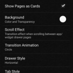
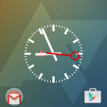
As was the case in the beta, the new drawer does not serve as Nova’s default. To enable the look, you’re going to have to tinker around with various settings. In the Drawer section, you can get started by selecting the “show pages as cards” option. After that, you will also need to hide widgets, adjust tabs, and swap out the app drawer icon before you’re left with something that could pass for the Google Now Launcher. Once everything’s just right, you can then break the illusion by enabling vertical scrolling or anything else that made you want to replace the default launcher in the first place.
Â
Â
Â
Â
Are there other changes found in this update? Not really. Does that make us care any less? Nope. We’re too busy swiping through those sweet white cards.
What’s new:
- Lollipop style drawer (Settings – Drawer – Show Pages as Cards)
- Renamed old Circle animation to Circle Wipe, new Lollipops style Circle animation
- Fixes and optimizations
Source : Android Police – Android News, Apps, Games, Phones, Tablets » Apps/Games


![Google Inbox 1.1 Tweaks The Material Design Layout, Especially On Lollipop [APK Download]](http://apkvan.com/wp-content/uploads/2014/11/1zsxV7D-150x150.png)

![Google Play Books Updated With Material Design And New Skimming Interface [APK Download]](http://apkvan.com/wp-content/uploads/2014/10/13lQzAS-150x150.png)
Leave a Reply