Rumor: A Project Codenamed Bigtop Will Be Google’s New Task-Oriented Email System
Reaching “Inbox zero” is not an easy task. Especially when there are those emails that might require future action, or those that hang in a nebulous state of still being useful despite the conversation having ended. It’s also not very easy to parse out exactly what you need to get done after poring over a page of emails. To address both of these issues (and a few others), Google has been working on a project called Bigtop. We’ve actually seen bits and pieces of Bigtop before in a leak from Geek.com, where the email system was positioned as belonging to a set of new Gmail features. We’ve got a bit more info (and a few visuals) that bring our current knowledge of Bigtop up to date, so let’s get started.
We do not have possession of any APKs we can distribute or unreleased devices, so please don’t ask for them.
Confidence Level
Our confidence on this rumor is a 7.5 out of 10. We know that this is a project actively in development and testing at Google, we know that it has been in progress for at least a year, and we know what its functionality looks like. What we aren’t sure of is how it will end up as a product. How Google positions this (replacing Gmail or introducing a separate email product) is still up in the air, and for that reason we deduct points. Points are also deducted simply because the granular details of the interface and functionality could easily have changed by now, and will likely change before launch.
The Rumor
Most of the rumor will need to be illustrated with pictures, so it’s worthwhile to take a boiled-down look at what we’ve seen first. Basically, Google is working on a new product to manage email and related tasks. The platform, which would be available for web, Android, and iOS as its own client on each platform, allows users to categorize messages through various actions, primarily focusing on pinning, snoozing, and marking done. Users can snooze things that need attention later, pin things that need attention now, and mark things “done” when they’re, well, done. This action is the equivalent of “archive” in Gmail. According to our information, messages could also be grouped into clusters, so if you have multiple threads related to the same task, they could be grouped and dealt with simultaneously.
I mentioned before that we aren’t certain how this will show up as a product. We know that the product is expected to show up at inbox.google.com which is currently restricted. From what we’ve seen, it seems that Bigtop may actually emerge as a product that can encompass any email service you already use, and in fact the information we’ve seen refers to the two as separate entities, but since this is still in testing it’s still possible that the features will simply roll into Gmail. We have, after all, seen Gmail’s new intro which confirms it will be able to handle various email services, but given the fact that the new Gmail interface looks nothing like what we’ll see below, it’s still probable that Bigtop will end up as its own product.
Having the basics of the rumor down, let’s move on to the details.
The Evidence
Perhaps raising more questions than it answers, the (heavily redacted) screenshot we’ll look at first shows us the features described above, plus lots more.
You’ll notice tons more categories for messages. The inbox isn’t divided by tabs at the top, but is defined by your selection in the hamburger menu to the left. Also of note is that Hangouts lives on the right of the screen as another menu. There’s of course a FAB for new messages as we saw before, and an enhanced view of messages and their attachments (which we’ll get to later), divided up by day. Users can dismiss all messages from a given time-frame or day with the icon at the top right of each section. The main view, as we understand it, is reserved for pinned (upcoming) and “un-triaged” messages, or messages that haven’t been explicitly dealt with by the user.
Also note the notification bubble – we’ve seen this pop up in a few places. It’s for notifications, but the bell icon has been replaced with a simple circle. We think Jingles is still hiding inside, but can’t be certain just yet.
Notable in this shot is the total lack of Google branding. It’s interesting to us that Google would build an email product that doesn’t feature the Google name in any way, but if it can in fact accommodate other email providers, this might make some sense – it would be a Google product but not one tied directly to the Google ecosystem. That said, what we’re seeing is a test site, so anything is possible.
Moving on, we’ve got mobile mockups based on what we’ve seen that elucidate some of the task-oriented functionality. These images are from earlier materials than the above screenshot, so things have almost certainly changed a bit since the materials we saw were created. Still, they hold fairly true to what we see above, so it’s worth taking a look.
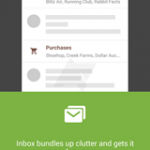
First, the main view. It’s clear here that Google is aware of how many new interface elements there are, and wants to explain to users what happens before actually taking any actions. This kind of approach is commonly seen in Samsung’s apps, where the features are so numerous that they need a quick one-step walkthrough on first action. It seems that Google has experimented with various implementations of this, represented in the images below.
Just as we saw in the web interface, Google plans to let users see attached images and documents without opening the email they’re attached to, as shown below. The previewing capabilities don’t stop there though, according to our information. Google wants to show users whatever may be of interest, so information about flights, shipping updates, hotel reservations, etc. will also show up right off the bat. Some of these things are expected to be actionable, just like Google Now cards. From what we’ve seen it appears things like flights and hotel reservations will have their own associated actions. This isn’t too surprising, given that Google has been extracting actions like “Confirm Email,” or “Check In” from relevant emails in Gmail for a long time now, placing those actions as buttons in the inbox.
Similar to Google Now’s current suggestions, Bigtop is also expected to be able to add appointments and reservations to your calendar by itself. This could of course be controlled by the user.
As for quickly “triaging” messages, it seems that a swipe to the left will snooze a message, while a swipe to the right is expected to mark it “done.”
Inside a message, users can triage it or perform the normal email actions like reply-all, forward, etc. Much like the current iteration of Gmail, it appears Bigtop would collapse old messages, showing the latest in the thread with the option to expand and read the previous correspondence. From what we’ve seen, the interface focuses on a black and white, bold, graphical style, with few distractions. Messages would evidently be closed with a simple cluster icon in the toolbar. Fingers crossed that this sparse interface makes it to launch, but anything can happen.
Final Thoughts
This rumor is one for which we had a lot of granular interface information. As with any rumor of this type, it’s important to keep in mind that small details and interactions can change easily. These things are in flux all the way until release. As we always warn, anything can and will change. We also don’t know when this will be ready. It could launch next week or next year – there’s simply no way of knowing just yet.
At any rate, the images and explanations above should paint a pretty clear picture of what Bigtop will be, whether it replaces Gmail or makes its debut as its own separate email product.
Source : Android Police – Android News, Apps, Games, Phones, Tablets » Apps/Games


![[Update: Wide Rollout?] Google Now Bill Reminders Rolling Out Now](http://apkvan.com/wp-content/uploads/2014/09/1u89jyQ-150x150.jpg)
Leave a Reply