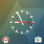
Apex Launcher Gets A Belated Material Makeover For Version 3.0, Plus A New App/Widget Picker
Here’s a quick rundown of the changes made for the Material Design update. It’s all pretty standard stuff, but put it together any it makes a dramatic difference. Some (but not all) of these visual options are available on older versions of Android.
- New modern UI with material design
- New material app icon
- Redesigned Apex action icons
- Lollipop drawer background and animation
- Lollipop folder style and animation
- Lollipop search bar and scroll indicator
- Lollipop drawer icon
- Lots of other UI tweaks and improvements
The other big change is a revamped interface for adding apps or widgets. It’s a mix between the more standardized adding interface and the one from the Google Now launcher, which moves the options to the bottom of the screen. There is also a new option in the Advanced settings menu which lets the user set the scrolling speed animation between home screen or drawer pages.
Source : Android Police – Android News, Apps, Games, Phones, Tablets » Apps/Games
Related Posts
(Visited 1 times, 1 visits today)


![Google Messenger Update Brings Custom Conversation Colors And No More Laggy Thread Opening Animation [APK Download]](https://apkvan.com/wp-content/uploads/2014/12/11WlKBM-150x150.png)
![[Updated] Google Chrome Beta Updated To v39 With Reader Mode And Tweaked Tab Closing Animation [APK Download]](https://apkvan.com/wp-content/uploads/2014/10/1sPl23T-150x150.png)
Leave a Reply