Google Field Trip 2.0 Update Brings Material Design Elements And Content From New Publishers
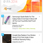
New above, old below
Â
Â
The app has jumped from version 1.22 all the way to 2.05. The structure has been re-arranged with a new slide-out menu taking priority for both the various sub-sections of the app and managing settings. It’s even easier to find local points of interest split up among categories like history, shopping, museums, architecture, and more, or you can just tap “everything” for a roulette approach to your next outing. Saved places and recent alerts are available to view, and a master switch for notifications is at the bottom (handy if you’re in a new city and you don’t have time to look around).
Google says that it has added new publishers for more content on Field Trip maps and categories, so even if you’ve exhausted your local points of interest you might find something new. Just about every part of the app has been tweaked or adjusted, so check it out if you’re a regular user. Even the app icon has been updated. Alternately, if you’re a fan of the older design, grab the previous APK from APK Mirror. Google doesn’t seem to be sending this update out in waves like it usually does – the unique Niantic Labs publisher likes to do things the old-fashioned way.
Source : Android Police – Android News, Apps, Games, Phones, Tablets » Apps/Games


![Google Messenger Update Brings Custom Conversation Colors And No More Laggy Thread Opening Animation [APK Download]](https://apkvan.com/wp-content/uploads/2014/12/11WlKBM-150x150.png)

![Google Inbox 1.1 Tweaks The Material Design Layout, Especially On Lollipop [APK Download]](https://apkvan.com/wp-content/uploads/2014/11/1zsxV7D-150x150.png)
![Google Play Books Updated With Material Design And New Skimming Interface [APK Download]](https://apkvan.com/wp-content/uploads/2014/10/13lQzAS-150x150.png)
Leave a Reply