Latest Nova Launcher Beta Includes Scrolling Animation Previews And Some Bug Fixes
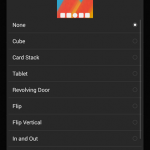
It’s also why the new animation preview on Nova Launcher 3.1, now available in beta, is so nice to see. It’s not a huge feature, just a little animated window that appears at the top of the pop-up settings menu for the launcher transition animations. It shows you, in a very basic and abstract way, what each animation option will look like. That saves you the trouble of the aforesaid waffling between the settings menu and the homescreen to see the results.
The rest of the changes mentioned on Google+ are fairly minimal: fixes for widget size reporting and the Today Calendar icon are the most crucial, though there are also improvements in memory usage and more general behind-the-scenes stuff. You can download the beta version of Nova Launcher via the Google+ community or directly from the Tesla Coil website (a nice touch). Changes should reach the standard version on the Play Store in a few weeks. Note: you’ll still need a paid version of Nova Launcher Prime to see more than three scrolling animation options.
Source: Kevin Barry (Google+)
Source : Android Police – Android News, Apps, Games, Phones, Tablets » Apps/Games

![[Updated] Google Chrome Beta Updated To v39 With Reader Mode And Tweaked Tab Closing Animation [APK Download]](https://apkvan.com/wp-content/uploads/2014/10/1sPl23T-150x150.png)
Leave a Reply