A Quick Look At The Next Step Toward Material For Google Play Books On Android Lollipop
Have you gotten tired of these app walkthroughs yet? We’ll, we have one more for right now – Google Play Books. The update to Google Play Books that we’re looking at here is – like everything else – pre-release, meaning things could change a little or a lot before the app is actually released. But what we’re seeing so far is a minor nudge for the app, bringing it into line with the rest of Google’s apps.
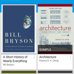
In many ways, Play Books is very similar to Google Play Movies, which we took a look at several days ago. It’s got a new icon, a new bold color that’s used everywhere in the app, and some new design paradigms. Notably, Play Books has the large color swatch covering the toolbar and tab interface, and in “My Library,” content flows over the color to collapse the toolbar as the user scrolls further.
Also notable is that the “sort” option has been broken out from the overflow to receive its own icon in the toolbar.
Â
Also similar to Play Movies (and other apps), the hamburger menu has received tweaks, with new iconography and a refreshed layout. Elsewhere, things are generally what you’d expect. All the settings are there, and “Read Now” is virtually identical to how it is now, save for the new toolbar, new typography, and buttons.
Â
This one is a small update so far, but a worthwhile one, bringing Play Books that much closer to compliance with Google’s new design standards.
Source : Android Police – Android News, Apps, Games, Phones, Tablets » Apps/Games
Related Posts
 A Quick Look At The Next Step Toward Material For Google Play Books On Android Lollipop
- A Quick Look At The Next Step Toward Material For Google Play Books On Android Lollipop
- A Quick Look At The Next Step Toward Material For Google Play Books On Android Lollipop
- A Quick Look At The Next Step Toward Material For Google Play Books On Android Lollipop
 [Update: Another Variation] Google Testing Extra Reminder Button In Inbox
- [Update: Another Variation] Google Testing Extra Reminder Button In Inbox
Leave a Reply